Monday, March 27, 2017

Red Edge Multispectral UAS Sensor Value Added Data Analysis of Impermeable Surfaces

Introduction to the MicaSense RedEdge 3 Sensor

The MicaSense RedEdge 3 sensor is a small multispectral sensor package that includes five sensors covering the red, green, blue, red edge, and infrared bands. This sensor can be attached to different UASs. In this project, data from one of these sensors connected to a DJI Phantom 3 is used. The flight covered an plot of land near Fall Creek, Wisconsin. One of the benefits of this sensor is that light meters can be attached. Other attachments can also be attached. The name of the sensor references the red edge band which aids in analysis of vegetation health. This band lies between the red and infrared bands.

Collecting information from all of these bands makes multispectral analysis possible. One form of analysis which is being performed in this project is value added data analysis. This technique registers different spectral signatures and teaches these to software via samples, which then enables the user to then run more analysis which can differentiate different segments of land cover. This is however just one of many different analyses that can be run after a composite image of all of the bands is created. Other basic functions (which were also performed in this project) include viewing the invisible bands (red edge and infrared) in false color in order to aid in vegetation health observation, and performing an NDVI (normalized difference vegetation index) function on the image in order to observe vegetation health.

Methods 

To begin data was processed in Pix4D. The project was given a descriptive title for its project folder (20160904_fallcreek_rededge). The images were then added using the add directories function and clicking on the folder that contained all of the images (Figure 1).
Figure 1
After this was complete, clicking through the prompts, the sensor and coordinate system settings were left alone. On the last prompt however, the template for the agricultural multispectral imagery was selected (Figure 2).
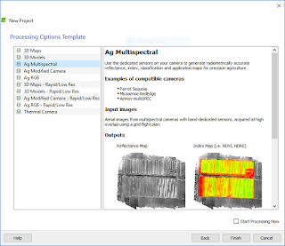
Figure 2
After clicking finish, initial processing was done. After the initial processing, the processing options were changed so that options that do not normally run with the template could be run. Boxes were checked so that the processing settings were as they look in Figure 3.
Figure 3
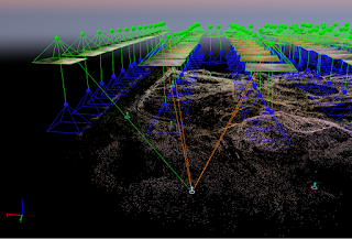
After running the second and third steps of processing, the resulting ray cloud was shown as seen in Figure 4. A quality report was also generated which is linked to here: https://drive.google.com/open?id=0B36dlU8PtG9pd1dvaV9JaHNyTnc
Figure 4
The resulting data (the non-transparent images that Pix4D created in the 2_mosaic directory in the 3_dsm_ortho directory of the project folder) was brought into and ArcMap map. The TIFF files (one for each band) were then run in the Composite Bands (Data Management) tool to create a composite raster of all of the bands created. Special care had to be taken to bring these bands into the tool in the order these bands fall on the electromagnetic spectrum (blue, green, red, red edge, near infrared). This is shown in Figure 5.
Figure 5
The resulting composite raster was then brought into an ArcMap three times to create three different layers. Each of these layers then had its symbology (bands on each channel in Figure 6) and labeling (table of contents in Figure 7) changed so that real color RGB, false color infrared, and false color red edge images could be created. These are all shown in their respective maps in the results section below.
Figure 6
Figure 7
For classification of permeable and impermeable surfaces using the unique spectral signatures of different areas of the image, a lesson on learn.arcgis.com was used: https://learn.arcgis.com/en/projects/calculate-impervious-surfaces-from-spectral-imagery/lessons/segment-the-imagery.htm

After downloading the data and files included with the lesson, the tasks were followed in the ArcGIS Pro project. Instead of working with the data provided by the lesson, the data that was supplied by the instructor of this course was used. From the composite image that was created earlier in the project in ArcMap, specific bands were extracted to work with, then similar pixels in that file were grouped into segments by a tool embeded in the tasks of the ArcGIS Pro file. From here the segmented image and the original mosaic were brought into ArcMap. Here the Image Classification toolbar and the Training Sample Manager were used to create a shapefile with training samples of all of the different classifications of land (roof, road, wood, cars, vegetation, and shadows). This is shown in Figure 8. The functions needed to be used are highlighted. Customize is highlighted because to be able to use the Image Classification toolbar the spatial analyst extension must be turned on.


Figure 8
From here, following the tasks (shown in Figure 9), the classifier was trained with the resulting shape file of the last step.
Figure 9
After training the classifier with the shapefile by following the instructions, the raster was classified with the resulting classifier definition file. This step was tricky because the tool would not save the raster in the geodatabase I was working in, only the folder containing it. Also once classified it was just a big pink square because it thought everything was vegetation. At this point a new training shapefile was created based on new selections, and the steps after that were run.

After this hurdle was overcome, the image was reclassified to get the simple two classification (impervious and permeable) scheme using the parameters which were given in the directions of the task window. The resulting TIFF file was then mapped in ArcMap and can be seen below in the results section.

Results and Discussion

The resulting maps are shown below.

Figure 10

Figure 10 shows the real color imagery (3,2,1). The imagery does have stripes of color distortion and other errors (weird shapes surounding the deck). These errors can be traced back to a few missteps in the field. First of all, the color distortions of some areas can be traced back to clouds obscuring parts of the area. This could have been corrected had a calibration disc been set out and the images calibrated later on in software processing, but this step was skipped out of ignorance because this was the operators first flight with the sensor. Another contributor to these distortions is the lack of a light meter which could have been bought and attached to the sensor. The weird shapes produced can possibly be traced to insufficient overlap of images. More images could have been taken and taken closer together. Another issue that was noted that could have resulted in poor final quality was that images were taken as the DJI Phantom 3 was still climbing and these images were more difficult to tie by the software into the final mosaic because of the difference in altitude and spatial resolution.
Figure 11

Figure 12
Figures 11 and 12 show maps made with false color IR and Red Edge. These, despite displaying different bands with red, are quite similar, which must reflect the fact that the two bands both adequately show vegetation health.

Figure 13
Many things could have been better with the permeable and impermeable surface map that is shown. It obviously shows the road, roof, house, and deck as impermeable but also included part of the shadow of the house. This could possibly have been prevented if the second attempt to create sample areas to train the classifier was done less quickly and hastily. I included only four categories instead of the original six (which didn't work), and I may not have included the shadow of the house in the shadow sample.

Conclusion

Multispectral imagery is a very versatile and valuable type of data! With a multispectral sensor such as the one used in this project combined with UAS, higher spatial resolution data than available multispectral satellite data can be collected, and at any time. This can then be processed to find permeable and impermeable surfaces as well as displayed in such ways as was done in this project (or in NDVI) to view vegetation health. After kinks with flight planning, light metering, and calibration are worked out, and GCPs are added, very highly accurate and quality data can be produced.  


Monday, March 13, 2017

Pix4D Image Processing with Ground Control Points


Introduction:

In last weeks project, a set of images captured by two UAS flights were brought into Pix4D and processed together to create a DSM, point cloud, and an orthomosaic. This project can be seen below under "Pix4D Image Processing. This week the same is being done, except that the two flights are being processed as separate projects. The projects are then both processed with Ground Control Points (GCPs), and are merged together later.

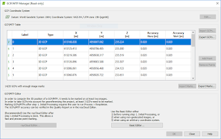
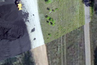
The fact that all of the data is processed with GCPs this week is big. The addition of GCPs means that the resulting orthomosaic and other data from the Pix4D process is much more spatially accurate (points in the imagery have much closer coordinates to their real world coordinates). GCP use starts with placing large markers on the ground. Large black and white, or black and yellow painted pieces of plywood were used for this specific project. These markers were placed spread out through the area being observed, and their locations in three dimensions recorded. Figure 1 shows an example in imagery that was collected. The very center of this point was used to for collection of coordinates. These coordinates are then recorded to a list, and the details of where the marker was are recorded so that later in processing the marker can be identified in imagery. After enough markers are identified enough times (each can be seen in multiple images due to overlap), the Pix4D software can then predict where each specific marker is in more images, and it can predict where the other markers are in images. The system can then correct the geometry of the data being produced to reflect the GCPs and their locations in the imagery, creating much more spatially accurate data.
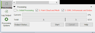
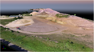
Figure 1
Methods: 

Figure 2
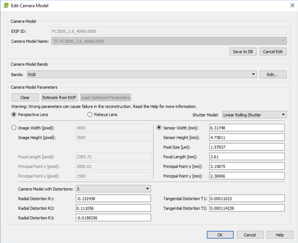
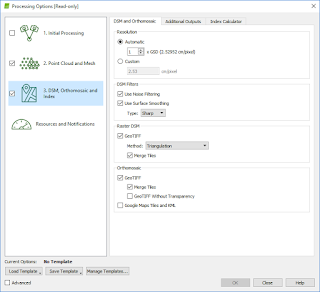
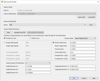
This week's methods were quite more involved than last weeks. In order to test out the project joining feature of the software, the two flights were processed separately instead of together, then joined. Each flight was processed with the same settings that were used last week (seen below under the title "Pix4D Image Processing") To recap, the photos of the parameters chosen are shown again below in Figures 2-4. Camera model settings had to be edited again because Pix4D does not recognize that the DJI Phantom 3 that was used has a rolling and not global shutter.
Figure 3

Figure 4
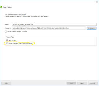
Figure 2 portrays a descriptive title similar to the titles given to the two projects processed. These titles were amended, however, to reflect their respected flight numbers. After these two projects were created, "Initial Processing" was run on each, the GCPs were added to each using the "Import GCPs" button and the text file supplied by the instructor (Figure 6), and then they were combined. This process began with opening a new project in Pix4D, but instead of clicking on new project, clicking on "Project Merged From Existing Projects," the option highlighted in Figure 5.
Figure 5
Figure 6
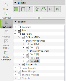
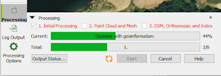
Each project file was then added to the subsequent list page, and "Initial Processing" was run again. Now, using the rayCloud view, GCPs were able to be located and pointed to in the imagery. After clicking on the specific GCP desired to be marked in the rayCLoud sidebar (Figure 7), the specific point that was located was then clicked very accurately in the middle after using the zoom function to get as close as possible in the "Images" box in the lower right hand corner of the screen (Figure 8). This was then done in a second image that was displayed below that image, after which "Apply", and then "Automatic Marking," were chosen in the above "Selection" box (Figure 8). These selections then generated more images below the already pinpointed ones to pinpoint for more exact georeferencing. After doing these steps for most if not all of the GCPs, the data was reoptimized so that the imagery could be "tied down" (Figure 11) and the second two processing steps "Point Cloud and Mesh" and "DSM, Orthomosaic and Index" were run, making sure to uncheck "Initial Processing" and change the "Raster DSM GeoTIFF Method" to "Triangulation" in the DSM, "Orthomosaic and Index" tab of the "Processing Options" window, which gives better resulting images. These last steps involve areas of the software shown in Figures 9-10.
Figure 7


Figure 8


Figure 9


Figure 10
Figure 11
These final steps allow the final DSM, three dimensional imagery (point cloud and triangle mesh), and the orthomosaic to be made. The DSM and orthomosaic can then be brought into ArcMap to create maps.

The addition of GCPs to the data increased the data quality by a lot. Having the GCPs allows Pix4D to create a real orthomosaic, which is geometrically corrected for the distortion introduced by differences in elevation. This creates a much more spatially correct image. The differences in spatial correctness can be seen below in Figures 12-13. Figure 12 shows the geolocation variance of the process after use of GCPs and Figure 13 shows the same but without the use of GCPs.
Figure 12
Figure 13


Results:

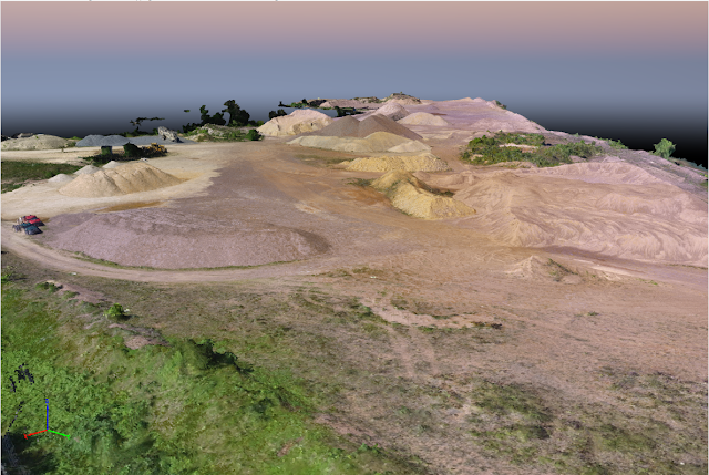
A view of the triangle mesh is shown in Figure 14.
Figure 14
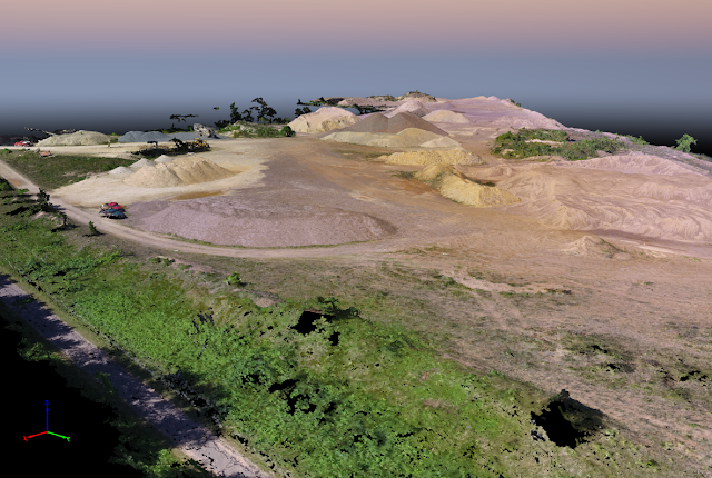
This image differs visually from the point cloud whose gaps are not filled in with triangles (Figure 15). 

Figure 15

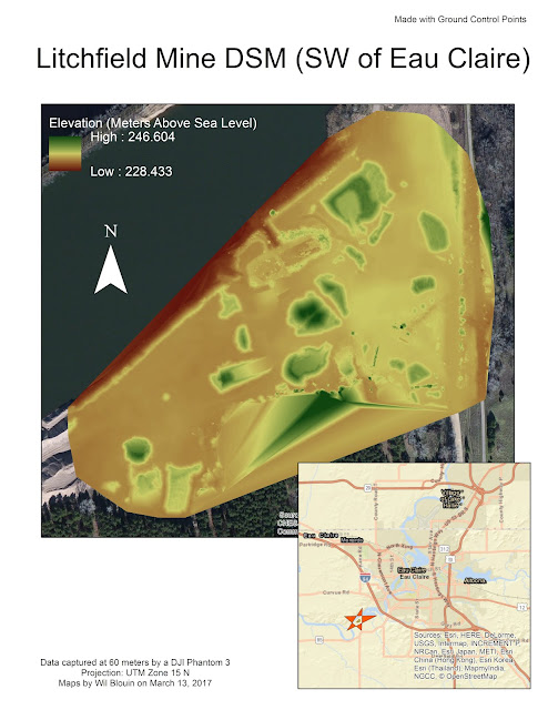
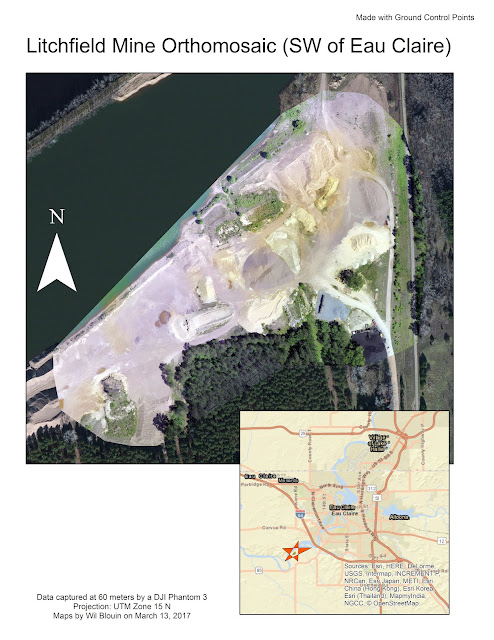
The resulting DSM from the data created is shown below in Figure 16. The DSM created from last week's project is shown below that in Figure 17. Next, the orthomosaic from this week is shown in Figure 18, and then the orthomosaic from last week's project is shown below that in Figure 19. 


Figure 16
Figure 17
Figure 18

Figure 19
These can be subjected to scrutiny and be viewed zoomed in. When this happens, the real difference between the maps using GCPs and without the use of them can be seen. This is demonstrated below. In Figure 20, you can see a gap between where the side of the road is in the background (orthorectified) imagery is, and where the side of the road is in the Pix4D processed imagery is. This is the orthomosaic made without GCPs. In the next image, Figure 21, there is far less of a gap, if there even is one. This is the magic of GCPs. The imagery is tied down at these points, and changes in elevation accounted for, to be able to orthorectify and geometrically correct the image for spatial accuracy.

Figure 20


Figure 21
Conclusion:

The addition of ground control points, although adding more time and energy to a project, is extremely important if highly spatially accurate information is wanted to be obtained. With the addition of GCPs, imagery can have spatial reference added to it that is far more accurate which means coordinates in the imagery mean the same points on the ground. The method used in this tutorial, with point coordinates of targets taken from the ground, is one way of doing this which works very well in Pix4D, but there are other ways as well. In software such as Erdas Imagine for example, one can use matching points in already highly accurate orthorectified images for the process (like the basemap that was added behind the imagery for comparison in Figure 20-21. For the Pix4D UAS data process however, this Xs on the ground method works very well and fits into the workflow, requiring a user not to have to use any other software.


Monday, March 6, 2017

Pix4D Image Processing

Introduction:

Pix4D is software that can be used to create point clouds and orthomosaic images from UAS aerial imagery. The software uses advanced algorithms to take overlapping images from the data set and build a three dimensional model of the specific area observed.

Pix4D Basics:

What is the overlap needed for Pix4D to process imagery?
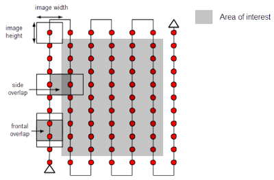
One necessity of UAS data for processing of UAS imagery in Pix4D is adequate image overlap. The recommended overlap in a general case is 75% frontal overlap and at least 60% side overlap. Pix4D also recommends that a regular grid pattern is used (as is shown in Figure 1) and that a constant height is used for data collection.
Figure 1


What if the user is flying over sand/snow, or uniform fields?
These conditions make it much more difficult for the software to find matching points in overlapping images for processing complex geometry and large uniform areas. For these conditions a minimum of 85% frontal overlap and 70% side overlap should be used. Also recommended is setting exposure settings accordingly on the sensor to get as much contrast as possible.

What is rapid check?
Rapid check is like regular initial processing but doesn't produce as good of an initial image.It is meant to be faster and just for ensuring that there is enough overlap for full processing later.

Can Pix4D process multiple flights? What does the pilot need to maintain if so?
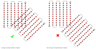
It can however special care must be taken. The flight patterns of both flights must overlap sufficiently, the two flights must be taken in very similar visual conditions, and the spatial resolution (flight height) must be the same.
Figure 2


Can Pix4D process oblique images? What type of data do you need if so?
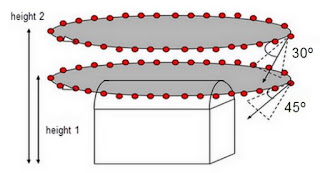
Pix4D can process oblique imagery for three dimensional models, but cannot create an orthomosaic in this mode. The software needs imagery at three different heights above the object being modeled, with each raise in elevation corresponding to a decrease in camera angle. This is shown in Figure 3.
Figure 3

Are GCPs necessary for Pix4D? When are they highly recommended?
Ground control points are not necessary just like georeferencing is not, but should be used in high precision georeferencing applications for the making of an orthomosaic. Situations where GCPs should be used are city reconstruction, and mixed nadir and oblique image aided reconstruction.

What is the quality report?
The quality report give you final quality information after processing of data. This report gives statistics and other information that aid the user in determining the quality and adequacy of the images created for their specific use.

Methods:

Figure 4
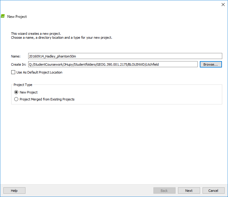
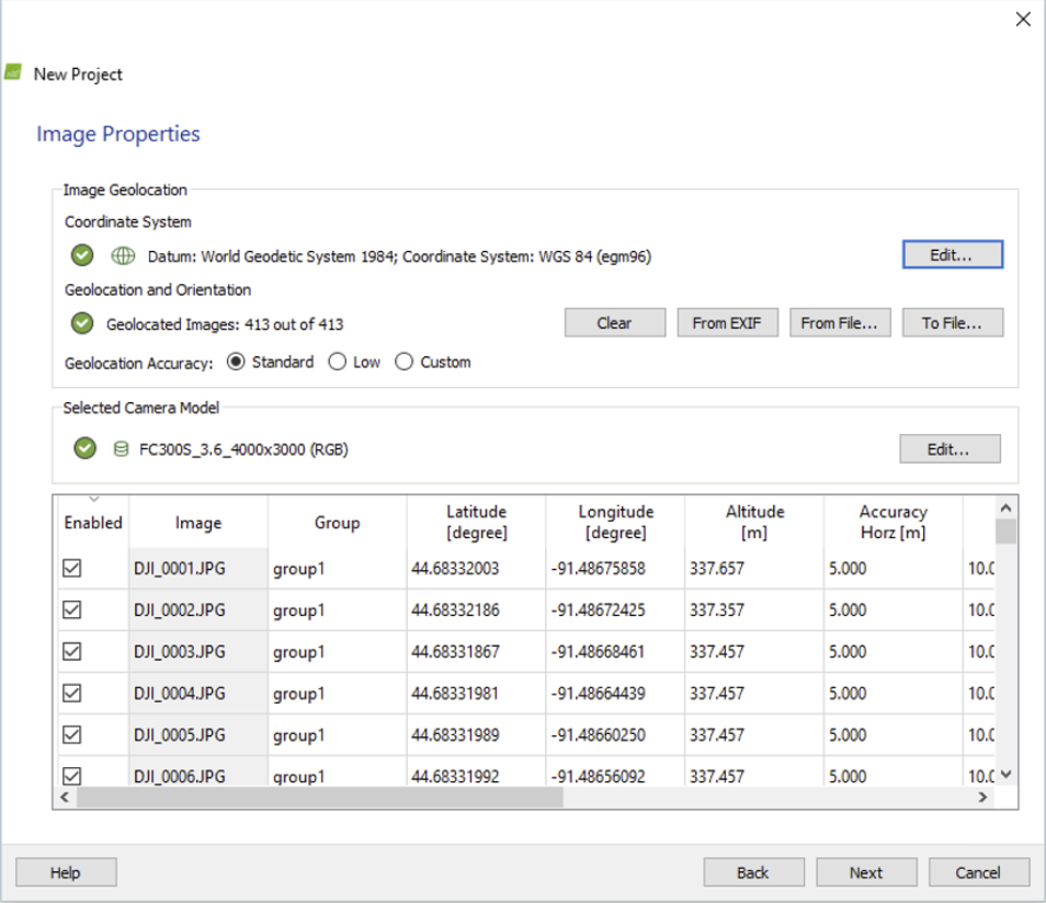
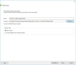
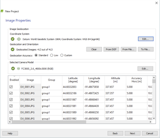
After opening Pix4D Mapper and clicking "New Project," a new project was made with a descriptive title including the name of the site, date, platform, and altitude, and was saved to my personal folder (Figure 4). Next, the images were added to the project (Figure 5). These came from the "Litchfield" folder including folders for two overlapping flights that was supplied by our professor. Now, due to an error not yet fixed in Pix4D the shutter of the camera model used and detected by Pix4D is set to global shutter when in fact it is a rolling shutter. This needed to be changed in the "Edit Camera Model" window so that the settings looked as shown in Figure 6. Clicking on, output coordinate system settings were not changed, and the "3D Maps" "Processing Options Template" was chosen. Now, processing steps 2 and 3 were deselected as shown in Figure 7. The "Processing Options" button also seen in Figure 7 was then clicked and under the third processing step tab the Triangulation method option was selected before the initial processing was started.
Figure 5

Figure 6
Figure 7
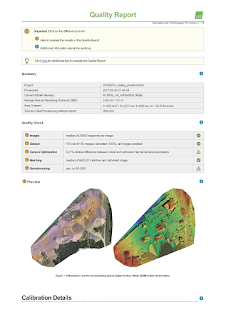
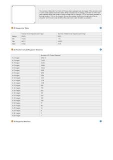
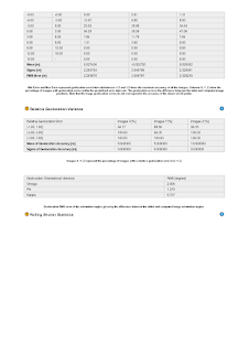
Now, after initial processing was completed and its resulting quality report examined (Figures 8-15), processing steps two and three were selected, "Initial Processing" was deselected, and final processing was run (Figure 16). In the quality report, good overlap was seen everywhere but the edges, where there was understandably less overlap. All images were used by the software.
Figure 8

Figure 9

Figure 10

Figure 11

Figure 12

Figure 13

Figure 14

Figure 15

Figure 16
After processing steps two and three finished, experimentation with the resulting DSM display options could be done. Turning off and on individually the tie points, point cloud, and triangle mesh, the various views were examined. A view of the triangle mesh is seen below in Figure 17. 
Figure 17
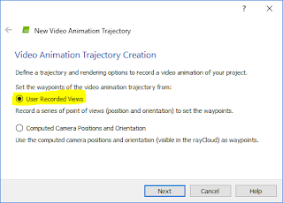
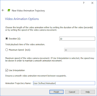
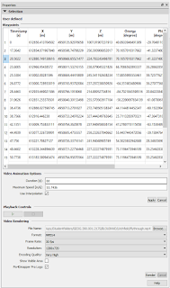
Another way to display the the resulting DSM was a flythrough video animation. By using the button highlighted in Figure 18, clicking the user recorded views button shown in Figure 19, recording individual points, and then using the parameters shown in Figures 20-21, I rendered a video. The video is shown under these.

Figure 18
Figure 19

Figure 20

Figure 21
Results:

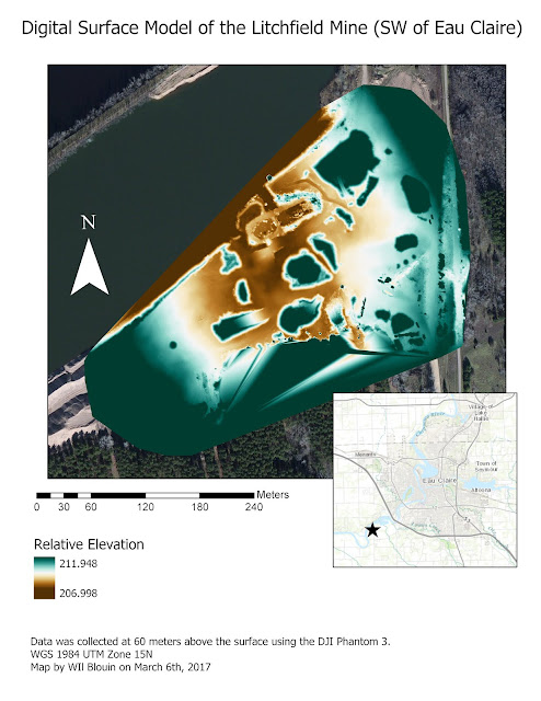
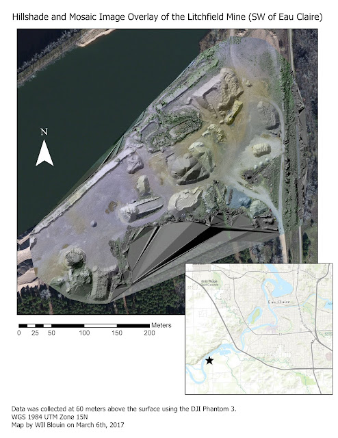
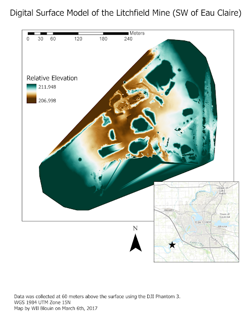
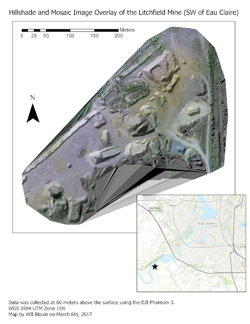
After creating the video (shown below) maps could be created. These are shown in Figures 22-23.


Figure 22 (vertical unit is meters)

Figure 23
These two maps show the data in different ways and can be cross referenced for clarification about certain areas of the map.

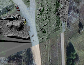
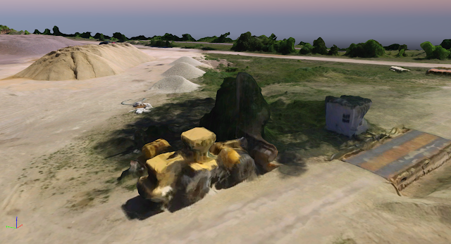
In discussion of the data mapped, a few faults were found, however they are far from serious enough for the resulting three dimensional images to not be used for representation of the mine. First of all, the data is not of high enough quality to successfully recreate cars, tractors, and other machinery that was at the site. This can be attributed to the orientation and distance from these objects that the images were taken from. If recreation of these complex geometrical objects was the goal, oblique imagery from multiple angles and heights for the objects would have to be taken, and even then errors may occur. An example (a tractor) is shown below in Figure 24.
Figure 24
Another point of discussion of this data is that there were no ground control points taken or used, and thus the resulting image from the process is not an orthomosaic and simply a georeferenced image. To dramatically increase data quality, GCPs should be used.

One final point of discussion is that in the maps produced there was data that software tried to interpolate in the south portion and the north-west portion of the image mosaic that shouldn't have been processed. This could potentially be cut out by the clip tool in ArcGIS Pro or ArcMap.

Conclusion:

In conclusion Pix4D is extremely powerful yet fairly simple to use software given adequate knowledge and understanding of the data being used. For example, understanding of the sensor's technical qualities need to be known for fine tuning and a properly executed and planned flight with proper overlap both on the sides and the front are required. In the end data is produced that can be used both by the Pix4D software itself, and other applications such as ESRI ArcGIS applications or CAD applications. This data can be used to create maps of the color ramp symbolized DSMs, ArcScene scenes, or even processed to make hillshade rasters or other images.